


Open any two titles on Lumora and the difference is immediate. One fills the top of the screen with a landscape: a desert, a corridor, a city at night. The other puts a tall poster in a dark room and leaves the middle of the page empty.
Neither is a bug. They are two different objects, and only one of them was designed for the place we are putting it.
Two rectangles, two jobs
A poster is 2:3 — 1000 pixels wide by 1500 tall. It was built for a wall, a shop window, a shelf in a grid. Its whole job is recognition at a glance from several metres away: one face, one title, one colour. Cram it into a wide hero and you get either a cropped forehead or two thirds of the screen doing nothing.
A backdrop — the "still", the "key art", the 16:9 frame — is 1920 by 1080 or thereabouts. It was built for a screen that is already on. It has room for a horizon, for two people standing apart from each other, for a light source. It does not need to shout, because you have already arrived.
The poster asks should I watch this. The backdrop says you are already in it.
What happens when a title has neither
Catalogue sites inherit whatever the studio published, and the studio does not owe us a uniform set. Some titles have a full backdrop. Some have a poster and a few scene stills. Some — especially older television, or anything whose rights moved — have a poster and nothing else.
The honest response is not to stretch the poster. It is to admit the shape and build around it: keep the poster at its own ratio, put it beside the text rather than behind it, and let the type do the work the photograph cannot. That is why the title pages here have two layouts and not one.
Why it matters more on a phone
On a laptop, a mediocre hero image is a missed opportunity. On a phone it is most of the experience: the first screen of a title page is that image, plus a title and one button. At 390 pixels wide, a backdrop is cropped to its centre third — which is why the good ones are composed with their subject in the middle and dead space at the edges.
In this story
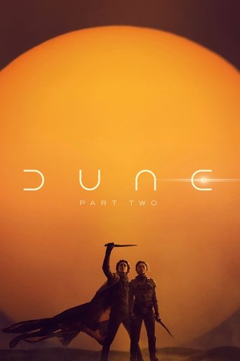
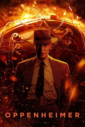
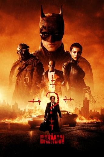
The rule we settled on
Wide artwork is used wide, full-bleed, behind the title. Narrow artwork is used narrow, beside it, with the dark background doing the rest. Nothing is upscaled past its source, nothing is stretched to fill a box it was not drawn for — and when a title has only ever been given a poster, the page looks deliberate rather than broken.
It is a small decision that happens on every title page, which is exactly why it is worth getting right.
- Artwork
- Design